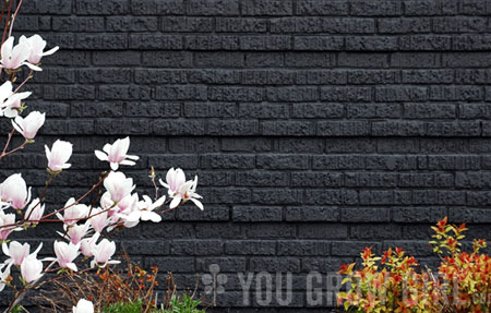
I came upon this colour palette yesterday and had an instantaneous response to it. The pink flowers are magnolia and the red and chartreuse bush on the right is ‘Goldflame’ spirea (Spiraea x bumalda). Of course it could just be the designer in me that is responding to the grid formation but I also think it is the black brick background serving as a contrasty backdrop… the colours just pop out against it. In conclusion: This reaffirms what I already know about chartreuse and deep red against black.
Note to self: Get more black containers.
wow! that black brick is gorgeous with those plants, what a great eye to notice that!
This reminds me of that Ezra Pound haiku,”In a station of the metro”
The apparition of these faces in the crowd;
Petals on a wet, black bough.
I love this color combo — Great photo! A few weeks ago, I was at a private garden where the fence was painted black. It really does make colors pop, especially colorful flowers and new springtime foliage.
It’s not just the designer in you… For me, I looked at the light pink flowers against the dark brick and said, WOW!
Great photo!
The colors, the texture! Beautiful!
I think you are exactly right. The black background provides the perfect canvas to showcase the simple beauty of these plants.
ok, I know this has nothing to do with this post, but I wasn’t sure how else to ask this question, so here goes! I’ve looked through the You Grow Girl book a bajillion times but on page 175, there is this awesome branch with red berries and yellow flowers on it. Unfortnately, there is no caption that says what it is. Can you tell me?
What a lovely combination….Fay
Love how the magnolia flowers pop against the black background.